The Psychology of Colors: How Every Shade Shapes Emotion in Art
Color is not just what we see — it’s what we feel.
In every brushstroke, artists use color as a silent language that speaks directly to the heart. Whether it’s the warmth of red, the calmness of blue, or the mystery of black, every hue has the power to trigger emotion before the viewer even understands the subject.
The Power of Red: Passion, Energy, and Life
Red is the color of intensity — it commands attention and ignites emotion. Artists use it to express passion, love, or even conflict. In visual art, red can make a piece feel alive, vibrant, and full of movement. It’s bold, emotional, and impossible to ignore.
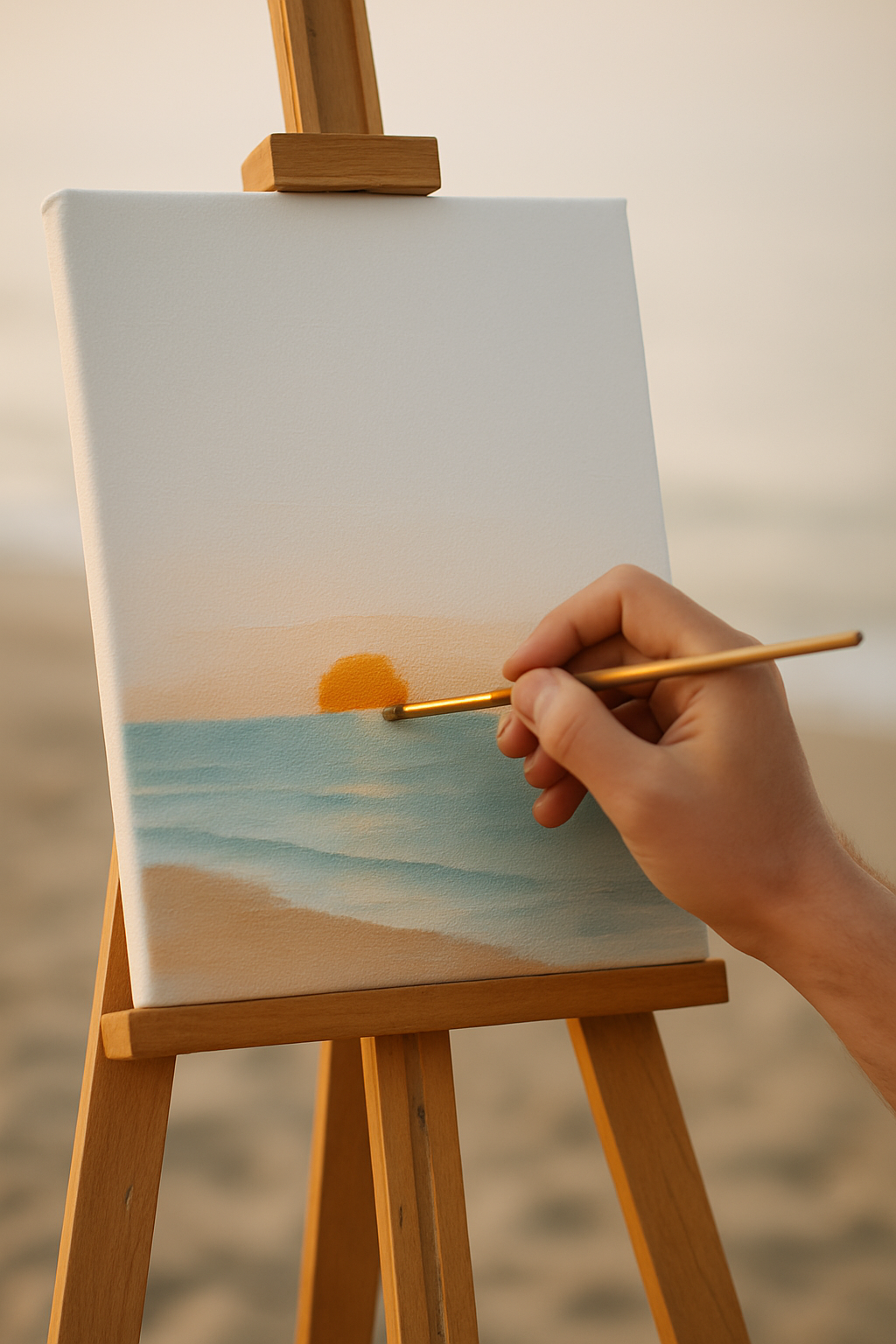
The Calm of Blue: Serenity and Depth
Blue, on the other hand, brings balance. It’s the color of peace, distance, and reflection. A blue-toned canvas invites the viewer to pause, breathe, and think. It softens emotions and turns chaos into calmness — perfect for art that aims to inspire clarity or inner peace.
The Nature of Green: Growth and Harmony
Green is the color of renewal. It bridges the emotional gap between warm and cool tones, symbolizing balance, hope, and stability. Artists use green to remind us of life — not just in nature, but within ourselves.
The Mystery of Black: Depth and Power
Black is not the absence of color; it’s the foundation of strength. It adds contrast, drama, and elegance. A touch of black can give definition to light, transforming a painting from beautiful to profound. In the world of art, black speaks in silence — commanding respect.
The Artist’s Palette: Emotion in Every Tone
True artistry lies in the ability to understand how colors communicate. The most powerful artworks aren’t just visually appealing — they feel alive. Through color, artists connect with the viewer’s subconscious, creating experiences that linger far beyond the canvas.
Art, at its core, is emotion translated into color. Every shade, tone, and gradient tells a story — not only about what we see, but how it makes us feel.